
Somewhere between agreeing the kitchen layout with your builder and arguing over worktop finishes, you're expected to choose tiles. Not just any tiles. Tiles that'll still look right in ten years. Tiles that'll survive kids, dogs, dropped cast iron pans, and whatever cabinet colour trend comes along next.
It's a lot. And because most of the advice out there is either a mood board with no practical detail or a trend piece that'll be outdated by next season, you're often left guessing.
This isn't that kind of guide. What follows is a practical decision framework covering material durability, colour and grout strategy, classic formats, layout, finish, and how to test samples properly before you commit. Work through it in order and you'll have a clear direction before you spend a penny.
The right material for kitchen conditions: porcelain vs ceramic tiles
Kitchens are genuinely hard on tiles. You've got heavy footfall, cooking oil in the air, dropped pots, and a floor that gets mopped more than any other room. The material you choose has to cope with all of that for years without chipping, staining, or losing its finish.
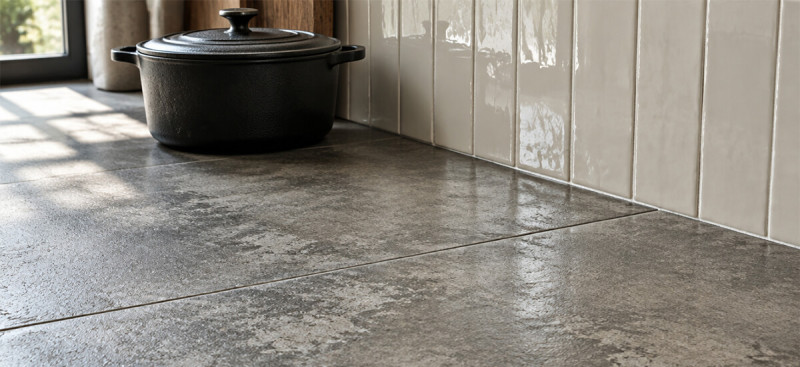
For kitchen floors, start with porcelain. It's denser and less porous than ceramic, which makes it more resistant to scratches, staining, and moisture penetration. That density also means it holds up better under heavy use and is less likely to chip if something falls on it.
Ceramic tiles are often perfectly fine for kitchen walls and backsplash areas. Less wear, no slip risk, and they're typically easier to cut for awkward tile-around-socket situations. Just confirm the product listing says "wall tile" or "floor and wall" before ordering.
The number you want to check on any glazed floor tile is the PEI rating. PEI ratings measure a glazed tile's surface abrasion resistance on a scale from 0 to 5, with higher numbers indicating better wear resistance for foot traffic (Porcelain Superstore). For a kitchen, Hyperion Tiles recommends PEI Class 4 as the minimum, describing it as suitable for moderate-to-heavy traffic. Class 5 is the highest rating and handles the most demanding residential and commercial environments.
If the product listing doesn't show a PEI rating, ask. If no one can tell you, that's a reason to look elsewhere.
A simple rule: if it's going on a kitchen floor, start with porcelain rated PEI 4 or above.
Colour and grout choices that won't feel dated
"Timeless" doesn't mean boring. It means your tile will still look considered and clean once your cabinets get repainted, your worktops get replaced, or your style preferences shift.
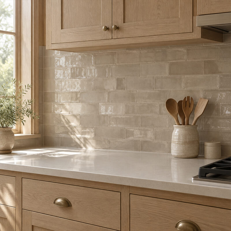
When it comes to kitchens, for tile colour, the most reliable palettes are warm whites, greige (grey-beige), soft greys, and stone-inspired neutrals. These tones work with oak kitchens, painted shaker doors, handleless contemporary cabinetry, and just about everything in between. They're not trendy. They're stable. That's the point.
Avoid using a single, trend-driven hero colour as your main tile field. A deep forest green backsplash might look extraordinary today, but it's a commitment that limits where you can go with future cabinet or worktop changes. If you want a bold colour, apply it in a smaller accent zone and keep the main tile field neutral.
Grout is where a lot of people make an avoidable mistake. The grout shade has an outsized effect on the finished look and on how much work you'll be doing to keep it clean. You have two sensible directions:
-
Blended grout (matching or close to the tile colour) gives a calmer, more continuous surface that reads as a single plane. It ages well because nothing is pulling the eye toward the grid.
-
Restrained contrast grout (charcoal or greige with a lighter tile) adds definition without shouting. It's a classic combination, particularly with subway tiles.
On the practical side: lighter grout shows every splash and cooking residue more visibly. Darker grout hides everyday dirt better but still needs to be sealed and cleaned regularly. Neither option is maintenance-free. The difference is how obvious the mess looks between cleans.
Classic patterns and formats that hold up over time
Format choice matters more than people expect. The shape and size of a tile affects how dated it feels faster than the colour does in many cases.
Subway tiles are the benchmark for a reason. The rectangular format has been used for well over a century, and it stays current because its character comes from how you use it, not from being fashionable. Change the colour, the grout contrast, or the sheen and you get a completely different result. A white gloss subway with dark grout reads as deli-classic. A greige matte subway with blended grout reads as quiet and contemporary. Same format, very different feel.
Hexagon tiles work well when kept in a consistent neutral palette. A small-format white or stone hexagon with pale blended grout is a kitchen classic. Where people go wrong is with bold colour contrast in a hex pattern; it becomes the dominant visual element in the room, and that kind of statement ages faster.
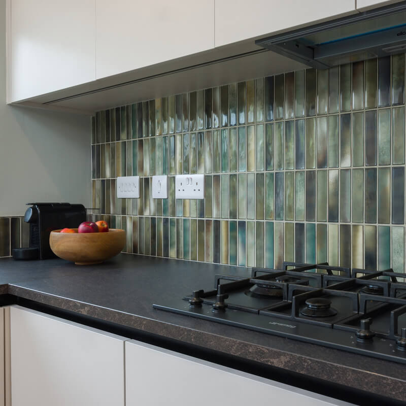
Zellige-look and natural stone-inspired tiles have had a strong run and are likely to remain popular because they reference real materials with genuine heritage. The key to keeping them from feeling trend-dependent is pairing them with simple surroundings. If your cabinets are strong in colour or texture, a complex zellige-style backsplash will compete. If your cabinets are calm and plain, a zellige-look tile gives the kitchen warmth and character without overwhelming it.
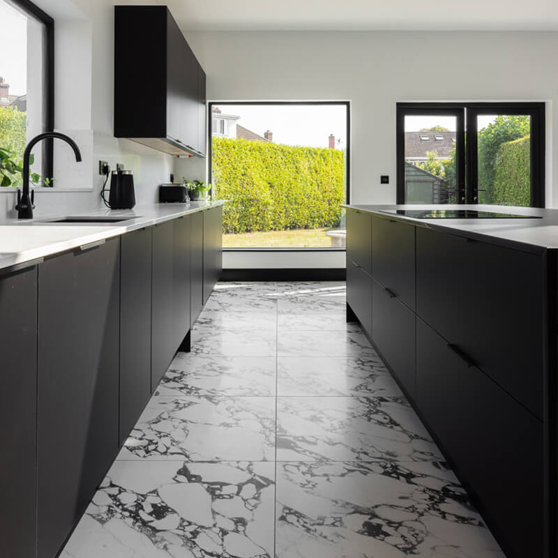
Large-format tiles (think 60x120cm or larger) have fewer grout lines, which creates a cleaner, more continuous surface. In busy kitchens where the eye is already dealing with appliances, cabinets, and lighting, fewer visual interruptions tend to look better over time. Large-format porcelain floors are particularly well-suited to open-plan kitchen-living spaces.
PRO TIP: One useful pairing principle: if your kitchen already has strong visual elements (a bold cabinet colour, a patterned worktop, or statement handles), keep the tile format and pattern simple. The tile should support the room, not compete with it.
Scale, layout, and grout line width (the decisions most people skip)
Getting the right tile is half the job. Getting the layout right is the other half, and it's where avoidable mistakes happen.
Scale is straightforward. Larger tiles suit larger rooms. In a smaller kitchen, a very large tile format can feel awkward and produce more cuts at the edges. In an open-plan space, a large-format floor tile with minimal grout lines often looks exceptional. Match the tile size to the room's actual proportions, not just what looks impressive on a screen.
For grout line width: tighter joints tend to look more contemporary and reduce the visual grid effect. Wider joints emphasise the tile grid more. This is partly an aesthetic preference and partly a practical consideration depending on the tile type (some tiles require a minimum joint width). Check the product specification before assuming you can go as tight as you'd like.
For layout, a running bond (offset/brick pattern) is the most forgiving and the most classic for rectangular tiles. It works at almost any scale and doesn't require the precision alignment that a straight stack needs to look intentional. If you're laying diagonal or herringbone, the pattern adds visual interest but increases the cutting complexity.
Before you place your order, work through this:
-
Measure the room including any islands or recesses
-
Map out openings, sockets, and fixed units
-
Plan for trim tiles and edge profiles at transitions
-
Add your waste buffer: 10% for standard straight or running bond layouts, 15% for diagonal, herringbone, or rooms with many cuts (as per standard tile waste guidance)
Running short mid-project is one of the more expensive mistakes in a renovation, especially if the tile you're using is a specific batch or dye lot.
Finish and slip ratings: practical decisions for kitchen floors
Matte vs gloss is a real trade-off, not just an aesthetic one.
Matte tiles are easier to live with in a kitchen. They hide minor scuffs, don't pick up fingerprints and smears as visibly, and create less glare in kitchens with strong overhead or under-cabinet lighting. They also tend to have better inherent grip, which matters on a kitchen floor.
Gloss tiles look very sharp when clean and can make a compact kitchen feel brighter. But in a working kitchen, they show every mark and require more frequent wiping to stay looking their best. They can also become slippery when wet.
For kitchen floors specifically, check the slip rating on the product listing. One widely cited standard for level interior floors likely to be exposed to moisture is a minimum Dynamic Coefficient of Friction (DCOF) of 0.42, referenced in ANSI A326.3 guidance. On the Tile Merchant product pages, slip rating information is listed for floor tiles, so it's worth checking before ordering.
On cleaning: tiles are only as low-maintenance as you make them. Avoid acidic or abrasive cleaners on natural stone-effect porcelain. Seal grout joints properly after installation. A quick wipe routine after cooking (especially around the hob) will keep grout colour consistent for years. The biggest cause of grout looking tired isn't the grout itself, it's neglect combined with the wrong cleaning product.
Testing samples in your actual kitchen before committing
No screen, no showroom lighting, and no printed swatch will tell you how a tile looks in your specific kitchen at 7am or under your specific pendant light at 8pm.
The sample stage matters. Order samples and test them in situ before placing a full order.
A few things to check:
-
Look at each sample in morning light and in evening light. Tiles that look warm and stone-like in daylight can read as flat and cold under artificial light, and vice versa.
-
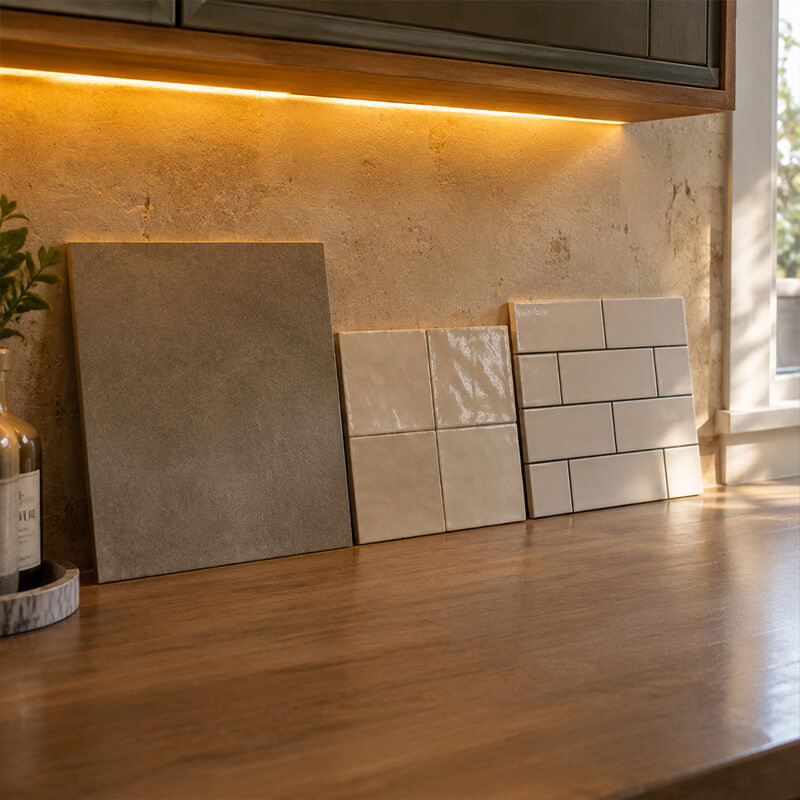
Hold the sample near the area it'll actually cover. A backsplash tile should be propped up behind your worktop, not laid flat on a table.
-
Check the sample against your cabinet door and worktop finish at the same time. You're not matching; you're making sure they don't clash. A tile that works with today's cabinet colour should also work if you repainted those cabinets in two or three years.
-
For floor tiles, place the sample on the floor and walk past it. Glare issues and texture become apparent very quickly.
Keep your sample selection manageable. Order three to five options maximum: ideally one floor candidate and one or two backsplash options. More than that and the decision gets harder, not easier.
At Tile Merchant, samples arrive fast. Multiple customer reviews report receiving samples within two days, with one customer noting their delivery came through the following day despite the site estimate of two to four days. When you're mid-renovation and your tiler has a slot booked, that turnaround matters.
FAQs: Choosing Kitchen Tiles That Won't Date
What's the best tile material for a kitchen floor that won't date?
Porcelain is the better choice for kitchen floors, since it's denser and less porous than ceramic, making it more resistant to scratches, staining, and moisture over time. Look specifically for a PEI rating of Class 4 or above, which indicates the tile can handle moderate-to-heavy foot traffic without losing its finish. Ceramic remains a good, more affordable option for walls and backsplash areas, where wear and moisture exposure are lower. Browse our porcelain kitchen tiles range to compare options.
What kitchen tile colours stay timeless rather than dated?
Warm whites, greige (grey-beige), soft greys, and stone-inspired neutrals are the most reliable choices for a main tile field, since they work with almost any cabinet colour or worktop finish, including ones you might switch to years from now. A bold, trend-driven colour can look striking today but limits your options later; if you want colour, apply it in a smaller accent area rather than across the whole kitchen.
Which tile patterns and formats are classic and won't go out of style?
Subway tiles, hexagon tiles, large-format tiles, and zellige-look tiles all have strong, long-standing track records. Subway works because its character comes from colour, grout, and sheen choices rather than the format itself being trendy. Hexagon holds up best in a consistent neutral palette rather than bold colour contrast. Large-format tiles (60x120cm and above) suit open-plan kitchens with fewer visual interruptions. See our subway tile range, hexagon tile range, and large format tile range to compare.
What size tiles should I choose for my kitchen?
Match tile size to the room's actual proportions rather than to what looks impressive in photos. Larger tiles suit larger or open-plan kitchens, where fewer grout lines create a cleaner look; in a smaller kitchen, an oversized tile can feel awkward and produce more edge cuts than a moderately sized format.
What grout colour should I choose for a kitchen that won't look dated?
Two directions work well long-term: a blended grout close to the tile colour, which reads as a single, continuous surface and ages well since nothing draws the eye to the grid, or a restrained contrast grout (charcoal or greige against a lighter tile), which adds definition without becoming the dominant feature. Either way, grout needs to be sealed and cleaned regularly; lighter grout shows marks more visibly, while darker grout hides everyday dirt better.
Should I choose matte or gloss tiles for a kitchen floor?
Matte is generally the more practical choice for kitchen floors specifically, since it hides scuffs and smears better, creates less glare under kitchen lighting, and tends to offer better underfoot grip. Gloss tiles look sharp when clean and can brighten a compact kitchen, but they show marks more readily and can become slippery when wet, which matters more on a floor than a backsplash.
What slip rating should kitchen floor tiles have?
For a level interior floor likely to see moisture, a minimum Dynamic Coefficient of Friction (DCOF) of 0.42 is a commonly cited benchmark under ANSI A326.3 guidance. Slip rating information is listed on our product pages, so it's worth checking before ordering, particularly if you're choosing a gloss finish.
How do I keep kitchen tiles looking good for years?
Consistent, correct maintenance matters more than the tile choice itself. Seal grout joints properly after installation, avoid acidic or abrasive cleaners on natural stone-effect porcelain, and wipe down the area around the hob regularly to stop grout discolouring over time. Most tiles that look tired after a few years suffer from inconsistent cleaning or the wrong products, not from the material wearing out.
Where to go from here
If you've worked through all of the above, you're in a much better position than most homeowners heading into a kitchen tile decision. The short version of what you've just read:
-
Floor tiles: choose porcelain, PEI Class 4 or above, with a suitable slip rating
-
Colour: stay in warm whites, greiges, or stone-inspired neutrals for the main field
-
Grout: blend for calm longevity, or use charcoal/greige for restrained contrast; seal it properly
-
Formats: subway, hexagon, large-format, and zellige-look tiles all have strong track records; pair them simply
-
Layout: plan your scale, your grout joint width, your waste buffer (10-15%), and your trim details before ordering
-
Finish: matte for practical kitchen floors; gloss only if you're comfortable with the cleaning commitment
-
Samples: test in your own kitchen, in your actual light, next to your actual cabinets
You can browse porcelain floor tiles, kitchen wall and backsplash tiles, and classic formats including subway and large-format ranges on the Tile Merchant website. If you'd prefer to see options in person, the showrooms in Ballymount, Coolock, Deansgrange, and Ashbourne are open seven days a week.
Order your samples first, get them in the light where it counts, and make the call from there. That's the most practical thing you can do.
Ready to see how a tile actually looks in your kitchen? Order free samples and test them in your own light, next to your own cabinets, before committing to a full order.
Why Choose Tile Merchant?
Ready to start? Browse the full tile range on tilemerchant.ie.
We offer extremely competitive pricing on our entire range of tiles and likewise. We stock a huge range of wall and floor tiles, and our prices are competitive for retail and trade. Our stock is widely available in our tile stores in Ireland, which are open 7 days a week.
Alternatively, if you’d prefer to shop our tiles online, we can supply you with free samples delivered for free.

 Website